リストはホームページをキレイに見せるためにも役立つし、訪問者にもわかりやすいサイトだと認識させることができるHTMLタグです。一般的にリストタグを使用するとSEO効果も高いといわれていますので、できるだけ使うようにするといいと思います。
 nov
定義・説明リスト(dl-dt-dd)タグの解説は以下のページへどうぞ!

マークつきのリストを作る(<ul>~</ul> <li>~</li>)
リストの基本形です。
マークつきのリストを作りたい場合はこちらのタグを使用します。
<ul>タグで全体を囲い、項目ごとに<li>タグを使用します。
リストはWeb上キレイに表示されますので、積極的に使っていくことをオススメします。
<ul>
<li>リスト1</li>
<li>リスト2</li>
<li>リスト3</li>
<li>リスト4</li>
<li>リスト5</li>
</ul>
↓↓↓
- リスト1
- リスト2
- リスト3
- リスト4
- リスト5
番号つきのリストを作る(<ol>~</ol> <li>~</li>)
番号つきのリストを作るときに使用します。
こちらは<ol>タグで全体を囲い、項目ごとに<li>タグを使用します。
<ol>
<li>リスト1</li>
<li>リスト2</li>
<li>リスト3</li>
<li>リスト4</li>
<li>リスト5</li>
</ol>
↓↓↓
- リスト1
- リスト2
- リスト3
- リスト4
- リスト5
コピペOK!リストをおしゃれにするCSSデザインコード20選
- ul と ol の両方に完全対応
-
デフォルトのマーカーをリセットし、番号を表示するデザインではCSS Counterを採用しているため、HTMLが <ul> でも <ol> でも自動で美しいナンバリング(01, 02…)やアイコンが反映されます!
- 外部フォント&アイコン不要
-
チェックマークや矢印、ドットはすべて純粋なCSSのみで描画!
- レスポンシブ完全対応
-
横並びデザインも含め、スマホ表示で崩れません。
① 洗練されたカード・ブロック型(縦並び)
サンプルのリストは画像なので、サイズがバラバラですがご了承ください。
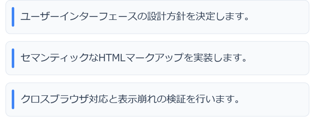
01. ミニマル角丸カード(左ピルアクセント)
余白をしっかり取った個別カードに、左端のアクセントバーを添えた清潔感のあるデザインです。
<ul class="list-card-pill">
  <li>ユーザーインターフェースの設計方針を決定します。</li>
  <li>セマンティックなHTMLマークアップを実装します。</li>
  <li>クロスブラウザ対応と表示崩れの検証を行います。</li>
</ul>
.list-card-pill {
list-style: none;
padding: 0;
margin: 0;
display: flex;
flex-direction: column;
gap: 0.75rem;
}
.list-card-pill li {
position: relative;
padding: 0.9rem 1rem 0.9rem 1.5rem;
background-color: #f8fafc;
border: 1px solid #e2e8f0;
border-radius: 8px;
color: #334155;
line-height: 1.6;
}
.list-card-pill li::before {
content: '';
position: absolute;
top: 50%;
left: 0.6rem;
transform: translateY(-50%);
width: 4px;
height: 60%;
background-color: #3b82f6;
border-radius: 99px;
}
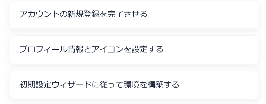
02. フローティング・エレベーションカード(浮遊感)
わずかな浮き上がりとソフトシャドウで、項目ごとに独立したカードに見せるリッチなスタイルです。
<ol class="list-float-card">
  <li>アカウントの新規登録を完了させる</li>
  <li>プロフィール情報とアイコンを設定する</li>
  <li>初期設定ウィザードに従って環境を構築する</li>
</ol>
.list-float-card {
list-style: none;
padding: 0;
margin: 0;
display: flex;
flex-direction: column;
gap: 0.8rem;
}
.list-float-card li {
padding: 1rem 1.25rem;
background: #ffffff;
border-radius: 10px;
box-shadow: 0 4px 12px rgba(0, 0, 0, 0.05);
border: 1px solid #f1f5f9;
color: #1e293b;
transition: transform 0.2s ease, box-shadow 0.2s ease;
}
.list-float-card li:hover {
transform: translateY(-2px);
box-shadow: 0 6px 16px rgba(0, 0, 0, 0.08);
}
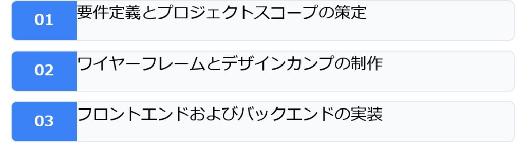
03. ツートン・スプリットブロック(左ブロック分割)
左側に番号用の独立した背景領域を作り、右側に本文を配置する情報設計に優れたデザインです。
<ul class="list-twotone-block">
  <li>要件定義とプロジェクトスコープの策定</li>
  <li>ワイヤーフレームとデザインカンプの制作</li>
  <li>フロントエンドおよびバックエンドの実装</li>
</ul><ul class="list-twotone-block">
  <li>要件定義とプロジェクトスコープの策定</li>
  <li>ワイヤーフレームとデザインカンプの制作</li>
  <li>フロントエンドおよびバックエンドの実装</li>
</ul>
.list-twotone-block {
list-style: none;
padding: 0;
margin: 0;
counter-reset: twotone-counter;
display: flex;
flex-direction: column;
gap: 0.6rem;
}
.list-twotone-block li {
counter-increment: twotone-counter;
display: flex;
align-items: stretch;
background: #f8fafc;
border: 1px solid #e2e8f0;
border-radius: 6px;
overflow: hidden;
line-height: 1.6;
}
.list-twotone-block li::before {
content: counter(twotone-counter, decimal-leading-zero);
display: flex;
align-items: center;
justify-content: center;
min-width: 3rem;
background: #3b82f6;
color: #ffffff;
font-weight: bold;
font-size: 0.9rem;
padding: 0.5rem;
}
.list-twotone-block li {
padding-right: 1rem;
}
.list-twotone-block li::after {
content: '';
}
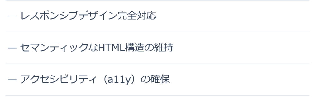
04. スタイリッシュ・セパレーター
余計な枠を排除し、極細のボーダーと微細なインデントだけで見せるミニマルデザインです。
<ul class="list-sleek-divider">
  <li>レスポンシブデザイン完全対応</li>
  <li>セマンティックなHTML構造の維持</li>
  <li>アクセシビリティ(a11y)の確保</li>
</ul>
.list-sleek-divider {
list-style: none;
padding: 0;
margin: 0;
}
.list-sleek-divider li {
position: relative;
padding: 0.85rem 0 0.85rem 1.5rem;
border-bottom: 1px solid #e2e8f0;
color: #334155;
}
.list-sleek-divider li:first-child {
border-top: 1px solid #e2e8f0;
}
.list-sleek-divider li::before {
content: '—';
position: absolute;
left: 0.2rem;
color: #94a3b8;
font-weight: 300;
}
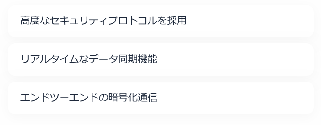
05. グラスモーフィズム(すりガラス風)
半透明の背景とぼかしフィルター(backdrop-filter)を組み合わせた先進的なデザインです。
<ul class="list-glass">
  <li>高度なセキュリティプロトコルを採用</li>
  <li>リアルタイムなデータ同期機能</li>
  <li>エンドツーエンドの暗号化通信</li>
</ul>
.list-glass {
list-style: none;
padding: 0;
margin: 0;
display: flex;
flex-direction: column;
gap: 0.6rem;
}
.list-glass li {
padding: 0.85rem 1.2rem;
background: rgba(255, 255, 255, 0.7);
backdrop-filter: blur(8px);
-webkit-backdrop-filter: blur(8px);
border: 1px solid rgba(255, 255, 255, 0.8);
border-radius: 12px;
box-shadow: 0 4px 20px rgba(0, 0, 0, 0.03);
color: #1e293b;
}
② CSSオリジナルアイコン&ナンバリング型(縦並び)
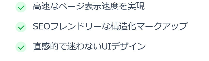
06. スタイリッシュ・チェックサークル(CSS描画)
SVGやアイコンフォントを使わず、CSSのborderだけで円形チェックアイコンを描画します。
<ul class="list-check-circle">
  <li>高速なページ表示速度を実現</li>
  <li>SEOフレンドリーな構造化マークアップ</li>
  <li>直感的で迷わないUIデザイン</li>
</ul>
.list-check-circle {
list-style: none;
padding: 0;
margin: 0;
}
.list-check-circle li {
position: relative;
padding-left: 2rem;
margin-bottom: 0.75rem;
line-height: 1.6;
color: #334155;
}
.list-check-circle li::before {
content: '';
position: absolute;
top: 0.2rem;
left: 0;
width: 1.25rem;
height: 1.25rem;
background-color: #dcfce7;
border-radius: 50%;
}
.list-check-circle li::after {
content: '';
position: absolute;
top: 0.45rem;
left: 0.45rem;
width: 5px;
height: 9px;
border-right: 2px solid #16a34a;
border-bottom: 2px solid #16a34a;
transform: rotate(45deg);
}
07. デュアル・同心円リング(洗練された二重丸)
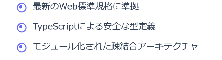
中央のドットと外側のリングで構成された、ミニマルながら知的な印象を与えるマーカーです。
<ul class="list-dual-ring">
  <li>最新のWeb標準規格に準拠</li>
  <li>TypeScriptによる安全な型定義</li>
  <li>モジュール化された疎結合アーキテクチャ</li>
</ul>
.list-dual-ring {
list-style: none;
padding: 0;
margin: 0;
}
.list-dual-ring li {
position: relative;
padding-left: 1.8rem;
margin-bottom: 0.7rem;
line-height: 1.6;
color: #334155;
}
.list-dual-ring li::before {
content: '';
position: absolute;
top: 0.35rem;
left: 0;
width: 14px;
height: 14px;
border: 2px solid #6366f1;
border-radius: 50%;
background-color: #ffffff;
}
.list-dual-ring li::after {
content: '';
position: absolute;
top: 0.6rem;
left: 0.25rem;
width: 6px;
height: 6px;
background-color: #6366f1;
border-radius: 50%;
}
08. グラデーション・スクエア(ひし形変形マーカー)
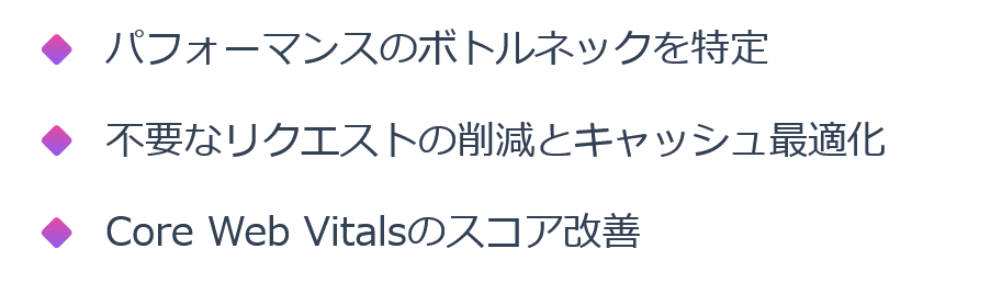
正方形を45度傾けてグラデーションを施した、目を引くアクセントマーカーです。
<ul class="list-diamond-gradient">
  <li>パフォーマンスのボトルネックを特定</li>
  <li>不要なリクエストの削減とキャッシュ最適化</li>
  <li>Core Web Vitalsのスコア改善</li>
</ul>
.list-diamond-gradient {
list-style: none;
padding: 0;
margin: 0;
}
.list-diamond-gradient li {
position: relative;
padding-left: 1.7rem;
margin-bottom: 0.75rem;
line-height: 1.6;
color: #334155;
}
.list-diamond-gradient li::before {
content: '';
position: absolute;
top: 0.45rem;
left: 0.15rem;
width: 10px;
height: 10px;
background: linear-gradient(135deg, #ec4899, #8b5cf6);
transform: rotate(45deg);
border-radius: 2px;
}
09. ネクスト・シェブロン(シャープな矢印マーカー)
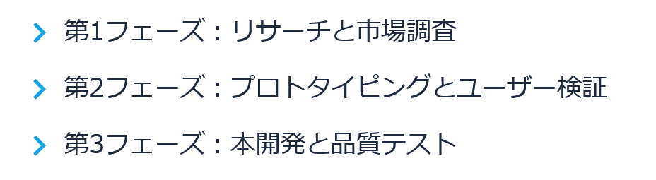
右向きのシャープな矢印(>)をCSSの枠線回転で描画した、読み手を先へ誘導するスタイルです。
<ul class="list-chevron-arrow">
  <li>第1フェーズ:リサーチと市場調査</li>
  <li>第2フェーズ:プロトタイピングとユーザー検証</li>
  <li>第3フェーズ:本開発と品質テスト</li>
</ul>
.list-chevron-arrow {
list-style: none;
padding: 0;
margin: 0;
}
.list-chevron-arrow li {
position: relative;
padding-left: 1.6rem;
margin-bottom: 0.65rem;
line-height: 1.6;
color: #1e293b;
}
.list-chevron-arrow li::before {
content: '';
position: absolute;
top: 0.5rem;
left: 0.2rem;
width: 7px;
height: 7px;
border-top: 2.5px solid #0ea5e9;
border-right: 2.5px solid #0ea5e9;
transform: rotate(45deg);
}
10. グラデーション・ビッグナンバリング(01、02…)
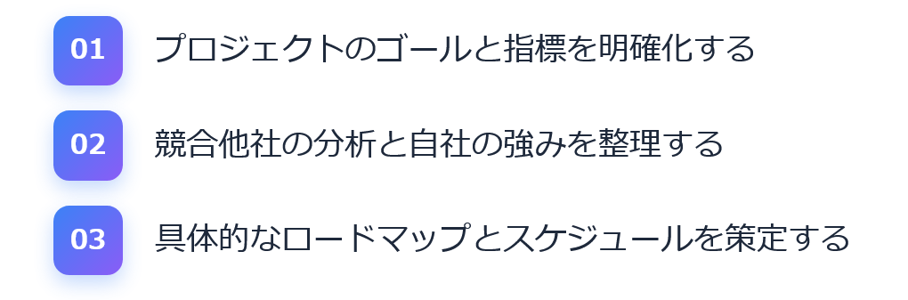
数字をグラデーションバッジにした、ランキングや手順解説に最適なモダンナンバーリストです。
<ol class="list-grad-num">
  <li>プロジェクトのゴールと指標を明確化する</li>
  <li>競合他社の分析と自社の強みを整理する</li>
  <li>具体的なロードマップとスケジュールを策定する</li>
</ol>
.list-grad-num {
list-style: none;
padding: 0;
margin: 0;
counter-reset: grad-counter;
}
.list-grad-num li {
counter-increment: grad-counter;
position: relative;
display: flex;
align-items: center;
gap: 1rem;
margin-bottom: 0.8rem;
line-height: 1.6;
color: #1e293b;
}
.list-grad-num li::before {
content: counter(grad-counter, decimal-leading-zero);
flex-shrink: 0;
display: flex;
align-items: center;
justify-content: center;
width: 2.2rem;
height: 2.2rem;
background: linear-gradient(135deg, #3b82f6, #8b5cf6);
color: #ffffff;
font-weight: 700;
font-size: 0.85rem;
border-radius: 8px;
box-shadow: 0 4px 10px rgba(59, 130, 246, 0.3);
}
③ モダンな横並び(フレックス・グリッド)型
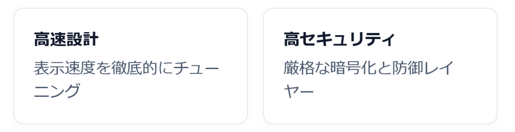
11. グリッド・フィーチャータイル(均等2〜3列配置)
カードが自動で横並びになり、画面幅に応じて折り返すレスポンシブグリッドです。
<ul class="list-grid-tiles">
  <li><strong>高速設計</strong>表示速度を徹底的にチューニング</li>
  <li><strong>高セキュリティ</strong>厳格な暗号化と防御レイヤー</li>
  <li><strong>拡張性</strong>柔軟なAPI連携とマイクロサービス</li>
</ul>
.list-grid-tiles {
list-style: none;
padding: 0;
margin: 0;
display: grid;
grid-template-columns: repeat(auto-fit, minmax(200px, 1fr));
gap: 1rem;
}
.list-grid-tiles li {
padding: 1.25rem;
background: #ffffff;
border: 1px solid #e2e8f0;
border-radius: 10px;
box-shadow: 0 2px 4px rgba(0, 0, 0, 0.02);
line-height: 1.5;
color: #475569;
}
.list-grid-tiles li strong {
display: block;
font-size: 1.05rem;
color: #0f172a;
margin-bottom: 0.35rem;
}
12. 水平ステップ・フロー(横並びプロセス遷移)
横並びで矢印がつながり、ステップ順(手順)を直感的に伝えるデザインです。
<ol class="list-step-flow">
  <li>プラン選択</li>
  <li>情報入力</li>
  <li>登録完了</li>
</ol>
.list-step-flow {
list-style: none;
padding: 0;
margin: 0;
counter-reset: step-counter;
display: flex;
flex-wrap: wrap;
gap: 0.5rem;
}
.list-step-flow li {
counter-increment: step-counter;
position: relative;
display: flex;
align-items: center;
padding: 0.6rem 1.4rem 0.6rem 1rem;
background: #f1f5f9;
color: #334155;
font-weight: 500;
border-radius: 6px;
}
.list-step-flow li::before {
content: counter(step-counter);
display: inline-flex;
align-items: center;
justify-content: center;
width: 1.4rem;
height: 1.4rem;
background: #0ea5e9;
color: #ffffff;
border-radius: 50%;
font-size: 0.75rem;
margin-right: 0.5rem;
}
.list-step-flow li:not(:last-child)::after {
content: '';
position: absolute;
right: 0.4rem;
width: 6px;
height: 6px;
border-top: 2px solid #94a3b8;
border-right: 2px solid #94a3b8;
transform: rotate(45deg);
}
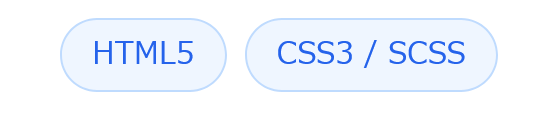
13. フレキシブル・ピルチップス(タグ風リスト)
キーワードやハッシュタグのように横並びで美しく折り返すコンパクトなリストです。
<ul class="list-pill-chips">
  <li>HTML5</li>
  <li>CSS3 / SCSS</li>
  <li>JavaScript (ESNext)</li>
  <li>WebPack / Vite</li>
  <li>Responsive Design</li>
</ul>
.list-pill-chips {
list-style: none;
padding: 0;
margin: 0;
display: flex;
flex-wrap: wrap;
gap: 0.5rem;
}
.list-pill-chips li {
padding: 0.35rem 0.85rem;
background-color: #eff6ff;
color: #2563eb;
border: 1px solid #bfdbfe;
border-radius: 9999px;
font-size: 0.85rem;
font-weight: 500;
transition: all 0.2s ease;
}
.list-pill-chips li:hover {
background-color: #2563eb;
color: #ffffff;
}
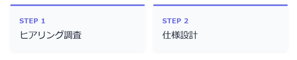
14. 水平インジケーター(ナンバード・バー)
上部にプログレスバーのような水平ラインを配した、洗練された横並びカードです。
<ol class="list-horizontal-bar">
  <li>ヒアリング調査</li>
  <li>仕様設計</li>
  <li>プロトタイプ制作</li>
</ol>
.list-horizontal-bar {
list-style: none;
padding: 0;
margin: 0;
counter-reset: bar-counter;
display: flex;
gap: 1rem;
flex-wrap: wrap;
}
.list-horizontal-bar li {
counter-increment: bar-counter;
flex: 1 1 180px;
position: relative;
padding: 1.2rem 1rem 1rem;
background: #f8fafc;
border-radius: 0 0 8px 8px;
border-top: 3px solid #6366f1;
color: #1e293b;
box-shadow: 0 2px 4px rgba(0, 0, 0, 0.04);
}
.list-horizontal-bar li::before {
content: 'STEP ' counter(bar-counter);
display: block;
font-size: 0.75rem;
font-weight: 700;
color: #6366f1;
margin-bottom: 0.3rem;
letter-spacing: 0.05em;
}
15. インライン・スラッシュセパレート(横並びリスト)
パンくずリストやメタ情報のように、横一列にスラッシュ(/)で区切るシンプルな形式です。
<ul class="list-inline-slash">
  <li>利用規約</li>
  <li>プライバシーポリシー</li>
  <li>特定商取引法に基づく表記</li>
  <li>お問い合わせ</li>
</ul>
.list-inline-slash {
list-style: none;
padding: 0;
margin: 0;
display: flex;
flex-wrap: wrap;
gap: 0.75rem;
align-items: center;
}
.list-inline-slash li {
position: relative;
color: #64748b;
font-size: 0.9rem;
}
.list-inline-slash li:not(:last-child)::after {
content: '/';
margin-left: 0.75rem;
color: #cbd5e1;
}
④ ユニーク・装飾型(タイムライン・付箋など)
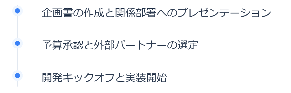
16. バーティカル・タイムライン(時系列ライン)
左側に1本の縦線が通り、各項目がドットで接続される時系列・ロードマップ用のデザインです。
<ol class="list-timeline">
  <li>企画書の作成と関係部署へのプレゼンテーション</li>
  <li>予算承認と外部パートナーの選定</li>
  <li>開発キックオフと実装開始</li>
</ol>
.list-timeline {
list-style: none;
padding: 0 0 0 1.5rem;
margin: 0;
position: relative;
border-left: 2px solid #e2e8f0;
}
.list-timeline li {
position: relative;
padding-bottom: 1.5rem;
padding-left: 0.75rem;
line-height: 1.6;
color: #334155;
}
.list-timeline li:last-child {
padding-bottom: 0;
}
.list-timeline li::before {
content: '';
position: absolute;
top: 0.3rem;
left: calc(-1.5rem - 5px);
width: 8px;
height: 8px;
border-radius: 50%;
background: #3b82f6;
box-shadow: 0 0 0 4px #eff6ff;
}
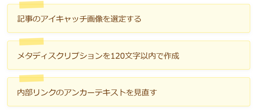
17. マスキングテープ・メモ風
上部にテープで貼られたような半透明のアクセントが付いた、柔らかいメモ風デザインです。
<ul class="list-sticky-memo">
  <li>記事のアイキャッチ画像を選定する</li>
  <li>メタディスクリプションを120文字以内で作成</li>
  <li>内部リンクのアンカーテキストを見直す</li>
</ul>
.list-sticky-memo {
list-style: none;
padding: 0;
margin: 0;
display: flex;
flex-direction: column;
gap: 1rem;
}
.list-sticky-memo li {
position: relative;
padding: 1.2rem 1.2rem 0.9rem;
background-color: #fefce8;
border: 1px solid #fef08a;
border-radius: 4px;
color: #713f12;
box-shadow: 0 2px 5px rgba(0, 0, 0, 0.04);
}
.list-sticky-memo li::before {
content: '';
position: absolute;
top: -6px;
left: 1.5rem;
width: 50px;
height: 14px;
background-color: rgba(253, 224, 71, 0.6);
transform: rotate(-2deg);
}
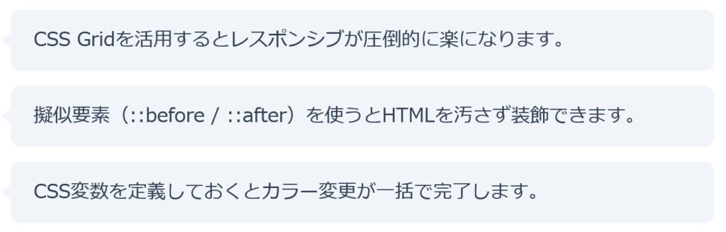
18. コメント・吹き出しリスト
左側に三角形のポインタを付け、会話やアドバイスを列挙するのに適したスタイルです。
<ul class="list-speech-bubble">
  <li>CSS Gridを活用するとレスポンシブが圧倒的に楽になります。</li>
  <li>擬似要素(::before / ::after)を使うとHTMLを汚さず装飾できます。</li>
  <li>CSS変数を定義しておくとカラー変更が一括で完了します。</li>
</ul>
.list-speech-bubble {
list-style: none;
padding: 0;
margin: 0;
display: flex;
flex-direction: column;
gap: 0.8rem;
}
.list-speech-bubble li {
position: relative;
padding: 0.8rem 1.2rem;
background: #f1f5f9;
border-radius: 8px;
margin-left: 10px;
color: #334155;
line-height: 1.6;
}
.list-speech-bubble li::before {
content: '';
position: absolute;
top: 50%;
left: -8px;
transform: translateY(-50%);
border-top: 6px solid transparent;
border-bottom: 6px solid transparent;
border-right: 8px solid #f1f5f9;
}
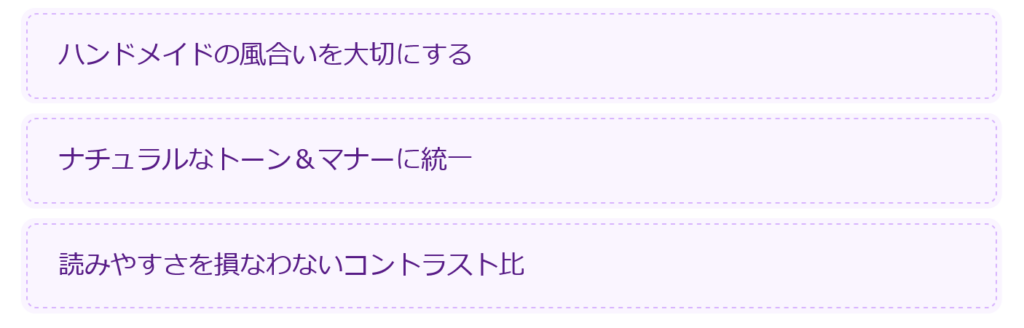
19. クラフト・ステッチ破線フレーム
内側にダッシュの縫い目(ステッチ)を施した、温かみのあるボックスリストです。
<ul class="list-stitch-craft">
  <li>ハンドメイドの風合いを大切にする</li>
  <li>ナチュラルなトーン&マナーに統一</li>
  <li>読みやすさを損なわないコントラスト比</li>
</ul>
.list-stitch-craft {
list-style: none;
padding: 0;
margin: 0;
display: flex;
flex-direction: column;
gap: 0.75rem;
}
.list-stitch-craft li {
padding: 0.8rem 1.2rem;
background-color: #faf5ff;
border: 1px dashed #d8b4fe;
border-radius: 6px;
color: #581c87;
box-shadow: 0 0 0 3px #faf5ff;
line-height: 1.6;
}
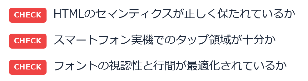
20. CHECKバッジ付きリスト
先頭に小さなラベルを添えた、まとめ記事の要点整理や注意喚起に最適なデザインです。
<ul class="list-check-badge">
  <li>HTMLのセマンティクスが正しく保たれているか</li>
  <li>スマートフォン実機でのタップ領域が十分か</li>
  <li>フォントの視認性と行間が最適化されているか</li>
</ul>
.list-check-badge {
list-style: none;
padding: 0;
margin: 0;
display: flex;
flex-direction: column;
gap: 0.75rem;
}
.list-check-badge li {
display: flex;
align-items: flex-start;
gap: 0.6rem;
line-height: 1.6;
color: #1e293b;
}
.list-check-badge li::before {
content: 'CHECK';
flex-shrink: 0;
font-size: 0.65rem;
font-weight: 700;
letter-spacing: 0.05em;
padding: 0.15rem 0.45rem;
background-color: #ef4444;
color: #ffffff;
border-radius: 4px;
margin-top: 0.2rem;
}
リストの中にさらにリストを入れる場合は、子要素の余白(margin-top 等)を少し付与するとさらに美しくレイアウトできます!